Return To The Abyss: Player Experience Update
THANKS FOR THE FEEDBACK!
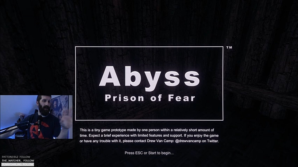
Several people have played Abyss since its Halloween release. Each of these people has offered helpful feedback. I even had the privilege to watch a few of you play through your shared videos and live streams, which is ideal. Everyone seemed to like the game but also had a few friendly, much appreciated criticisms.

Quick shout outs to just a select few people who offered a ton of really helpful feedback on the original release:
Terrible Darkness 10/10
All agreed that the atmosphere was appropriately spooky but too dark to explore effectively. While the game is meant to be very dark and simulate an uncomfortable prison, it is still supposed to be fun, so this was at the top of the list of things to attempt to improve.
Puzzles of Mystery
The device based puzzle elements posed a common problem for all who played. Each person, no matter what their background in games and puzzles, struggled to understand how things worked. Plus there was some general confusion about the prison layout and how to spot something that was interactive. This isn’t a problem with the puzzles per se, but rather with how they are presented, and being core to the game makes this a critical item.
THE BIG UPDATE
I took all the feedback and feature requests to heart and made a significant update. After pages and pages of notes, I made a list of specific changes. The focus of these changes was to make the existing experience more intuitive and pleasant. 50 hours of work later, I’ve crossed out the entire list plus a couple last minute items.
Ready, Settings, Play!

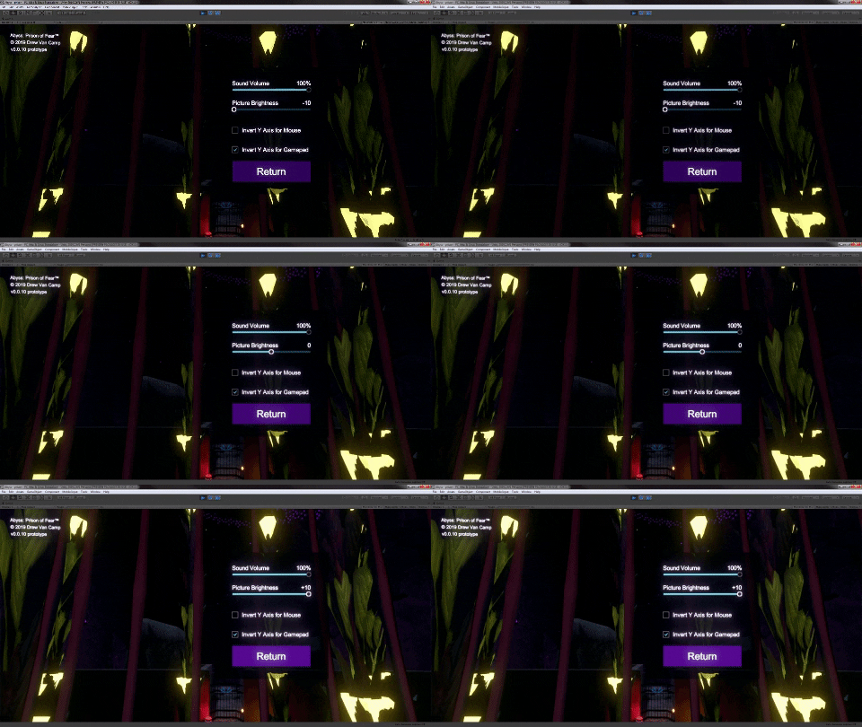
You can now adjust a few basic settings through a newly created menu system. Sound volume can be brought down. Picture brightness can be brought up. Controls for looking around can be inverted.
What just happened?
Devices have been redesigned to more clearly indicate that they are interactive, show what state they’re in at any given time, and reveal their relationship to other things in the environment. Similar but inconsistent interactions, such as gates that looked similar but behaved differently, have been better distinguished to avoid confusion and frustration.
Turn left at the wall...
The prison has itself received a few adjustments aimed to help you orient yourself within the environment. While I had my hands in the project, I noticed a couple locations where the lighting could be improved for visibility, contrast, and to help guide new players around.
WHAT’S NEXT?
The future of this project is unsure. It’s a lot of fun to work on and there are several details I would love to add to reveal some story, enhance the atmosphere, offer more variety of interactions, and even include another type of puzzle.
But this was never meant to be a long term project. It might be better to build a sequel or spin off game, but I’m torn and will ponder this decision. I would love to know what you think.
Other Games
Either way, I’m going to take a break from Abyss to continue work on my main Tron meets Galaga project REVO. I also plan to build one or two new, tiny games unrelated to either of those before I look again at Abyss.
Talk to me
Come discuss this all with me, either here in the comments or on the Cosmic Misfit Studio discord. I can also be found places like Twitter.
- What would you like to see happen to Abyss as a game, series, or universe?
- How does it feel to play Abyss after the update?
- Can you recommend another area to improve?
Get Abyss: Prison of Fear
Abyss: Prison of Fear
spooky puzzle adventure
| Status | Prototype |
| Author | Cosmic Misfit Drew |
| Genre | Adventure, Puzzle |
| Tags | Horror, Psychological Horror, Spooky |
| Languages | English |
More posts
- Access The Abyss: Simpler Controls+Mar 24, 2020
- Stare Into The Abyss: Post Halloween ReviewNov 04, 2019

Leave a comment
Log in with itch.io to leave a comment.